Colour Psychology: Why your brand colours matter
Colour psychology plays a huge role in how your business is perceived which is why your brand colours matter. 92% of consumers rank a brand’s visual identity as the most persuasive marketing factor.
When designing the branding and logo of your company, colour plays a critical role. A business’ logo and its colours are the first impressions of a brand, and typically the first thing that comes to mind when a target market thinks of that company.
As a PR agency, Adoni Media’s team are branding experts and understand how to create a recognisable visual identity that reflects a business and engages stakeholders. In this blog, we share why choosing the right brand colour/s is important and give our tips on how to get started.
Why do brands use certain colours?
It is important to choose your brand colours carefully as they have a direct influence on your brand’s identity and your target audience’s perception of your brand. Brand colours signify specific qualities and emotions.
The qualities and traits represented by different colours create nonverbal communication between your business and your target audience. This is why you must understand the psychology behind colours. It is important your brand palette appeals to your target audience and reflects your brand’s personality/reputation.
Brand colours are used to convey specific messages to customers and play a key role in boosting brand recognition.
Why is consistency important in branding?
Consistency in brand colours is vital in Public Relations and Digital Marketing, especially when building a visual identity. Consistency in colours across all business activities strengthens your brand’s recognition and awareness. This includes across your logo, website, storefront, in-store design, staff uniforms, packaging, business cards, email footers, social media, and advertisements.
When businesses are consistent with their brand colours, the colours become synonymous with the brand in the eyes of the public. For example, bright pink is predominately associated with Barbie and despite many redesigns, since the brand was created in 1959, the bright pink hue remains an iconic and easily recognisable element of the brand’s identity. The same goes for the red of the Qantas kangaroo or Coca Cola, the golden arches of McDonalds, or the iconic purple of Cadbury chocolate.
Why is colour important in branding?
Brand colours are used to influence how people perceive a brand and relate to it. Brand colours are the primary face of every business and often help to form the first impression. People are heavily influenced by their first impressions and make judgements in a matter of seconds. By aligning brand colours with how you want the brand to be perceived, businesses can influence consumer perceptions through their visual identity.
Smart businesses understand colour psychology and use colours to convey specific messages to customers. Each colour has different meanings, emotions, and traits attached. For example, blue is commonly associated with trust, stability, and integrity which is why it is commonly used across financial services.
How to choose a colour palette for your brand?
Before you choose your brand colours, you must understand what you want to communicate. Colours influence how people view the “personality” of a brand so it’s important to consider the kind of perception you want to create in the minds of your customer or client.
Colour is a powerful way for businesses to position themselves in the market and influence stakeholder perceptions. Your colours will shape and influence how the public sees you, so you must determine your brand identity first and then pick colours that represent that identity.
Once you establish what your brand identity is, it is time to determine which colours will work best. This starts with learning the emotions and traits associated with each colour.
What do your brand colours mean?
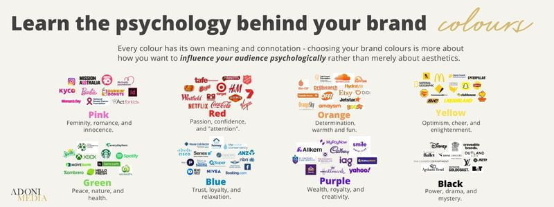
Every colour has its own meaning and connotation – choosing your brand colours is more about how you want to influence your audience psychologically, rather than merely about aesthetics.
Red — Red represents passion, excitement, and confidence. Red signifies importance and commands attention.
Orange — Orange represents determination, vitality and friendliness. Orange is invigorating and evokes energy.
Yellow — Yellow represents optimism, enlightenment, and joy. Yellow is attention-grabbing.
Green — Green represents peace, health, and nature. It can be used to signify prosperity and growth.
Light Blue — Light Blue represents tranquillity, trust, and loyalty.
Dark Blue — Dark blue represents professionalism, security, and trust. Dark blue is formal, mature, and trustworthy.
Purple — Purple represents wealth, creativity, and luxury.
Pink — Pink represents femininity, romance, and innocence.
Brown — Brown represents resilience, earth, and strength.
White — White represents cleanliness, virtue, or simplicity.
Grey — Grey represents neutrality, balance, and intellect. Grey is mysterious and mature.
Black — Black represents power and sophistication.
The impact and influence of your brand’s colour/s will also depend on how they are used, the style, and colour combinations. If you are unsure where to start, you can try colour palette generators.
How many colours should a brand have?
When it comes to choosing your brand colours, it’s a good idea to choose two to five colours. Most big brands use two or three. Most commonly, a brand will have two primary colours and one accent colour. By keeping your brand colours simple and specific, it is easier to stay consistent and build a recognisable visual identity.
Comparatively, exceeding five colours can overcomplicate and weaken your brand’s visual identity.
Of your two primary colours, one should be your base. This is the most important colour as it will be used the most often across your branding and marketing. It is key this colour reflects your business personality and appeals to your target audience.
It’s important to also have a neutral colour in your brand pallet. This will typically be used as a background colour so make sure to choose something subtle. Avoid bright colours and black as these can be too harsh and dominate your colour scheme. Hues of grey, beige, and white are typically safe choices.
The colour pallet your business chooses will play a key role in the way your company is perceived. As a PR agency, Adoni Media works daily to help businesses manage their brand and reputation so that they can connect with their target audience. These tips have been designed to help you build your brand’s colour palette in a way that reflects your business and connects with stakeholders.
For more tailored advice on how you can better brand your business, contact us.